By Henry Stevens
On Dominique’s Submissions page, we ask you to format your manuscript in the following way: double-spaced with size-12 Times New Roman font. Page numbers, word count, and author name are all optional as long as they do not impede reading. We ask that any variations on this format should be explained in the cover letter.
The reason we ask for submissions like this is because it helps us during our reading process. Yes, we are capable of reading a non-standard manuscript, and no, we’re not going to reject you outright if you don’t format your manuscript in the standardized way that we ask on our submissions page, but this format is standard across the industry. Stick to it and we are going to trust your authority. Abandon it, and we are going to be suspicious of your work even before we read the first word.
What does that mean?
A literary magazine exists largely on the internet and deals almost exclusively in anonymous, unsolicited submissions. Dominique attracts attention from a lot of people. Some of our authors are extremely well-established, having published their own books or placed numerous poems in journals before us. Others are just debuting. This may be their first publication.
But some people who submit are simply screaming into the void. They don’t care what anyone thinks of their work, and often this manifests by their unwillingness to follow simple instructions. If you’re reading this and wondering, nervously, “Is he talking about me?” I assure you I’m not. The people who do this probably don’t read our blog, and definitely wouldn’t think I was talking about them. But you should pay attention to our formatting requests because if you don’t, we will read your story wondering if you might be one of these people, and thus treat your story with greater suspicion.
I will let you in on a little secret: we don’t check these things to exact detail.
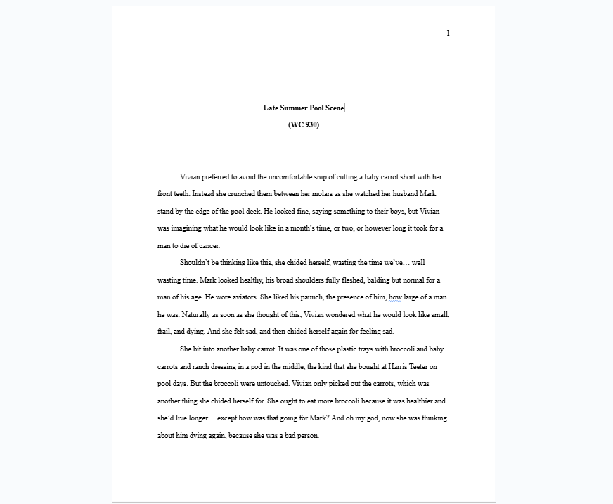
So, for example, this a screenshot of my story Late Summer Pool Scene, which is coming out in X-R-A-Y Lit soon. Here I am showing what a manuscript formatted to 12pt Times New Roman font with title, page number, and word count looks like. But check out the word count. It says 930, but in reality it is 929.
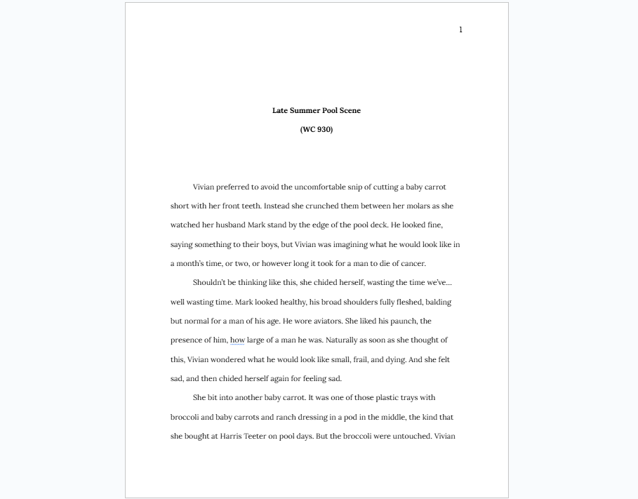
Now in this version, you can probably sense something is off, but you might have a hard time identifying what it is. The font has been changed to Lora. I think Lora is a stronger font choice because it looks a little more refined than Times New Roman, a little more spaced out, but still has that serifed formal look.
My typographical opinions aside, the point is that we probably won’t notice and definitely won’t care if you use Lora instead of TNR. In fact, I would even encourage you to use Lora, or some kind of formal looking sans serif font like Arial because the spacing is a bit wider and it is easier to read on a screen. This will make it a bit easier to read the submission and possibly give us an unconscious bias toward your work.
Use this trick with other magazines at your own peril, but I promise that no litmag I have worked at specifically checked the exact parameters of the texts we received. What we don’t want is something like this:
I’m not saying you can’t write like this. When I was working as a reporter in my hometown, my 90 year old boss would type out her weekly school board report in size 34 font and then let the editor resize it to 12 pt. In fact, you might even make an argument it is easier to read and therefore superior.
The problem is that it looks noticeably different from the industry standard and thus will stand out as amateur, untrained, or unwilling to follow directions, none of which you want to be seen as when we are reading your work. You might not think this matters, but consider this pretty common situation we run into as editors.
You are reading a manuscript and there are a lot of spelling errors. A very large number. However, this is a story told from a character’s first person perspective. Maybe these errors are part of that character’s illiteracy? Maybe this is a dialect thing you are unaware of? At this moment, you have to make a judgement call on whether you trust that this author knows what they are doing.
That’s the moment when all these little choices of formatting start to matter. If your manuscript is wildly formatted and we think you are amateur or raving into the wind, we are probably not going to give you the benefit of the doubt here. Your incredible stream of consciousness story will fail because no one bothers to even finish reading it. However, if you are following our manuscript guidelines, your story will look like a professional story and we will read you as if you are a professional author.
We will trust that you are taking us somewhere, rather than leading us into a literary cul de sac.
If you are trained in rhetoric, you will have already recognized that I am talking about ethos. The visual rhetoric of manuscript formatting is a rhetoric of establishing authorial ethos in order to maintain trust with the reader and demonstrate credibility through belonging to a fairly esoteric order–submitters to literary magazines. This is a standardized rhetoric across our field, so the manuscript you format here will be generally acceptable at most other literary magazines.
This is also why the cover letter and bio should follow a standardized format as well: it demonstrates to us that you are experienced and we should trust your authority as an author. Please address your cover letter as “Dear Editors,” and then give a one sentence introduction to the story that includes the title, the word count, and any relevant information that you think would be necessary to understanding it, such as genre, any important allusions, content warnings. etc.
Additionally, please include a short, third person bio in your cover letter. Your bio should summarize in a single phrase who you are as a writer, list any prior publications, and end with links to any social media or websites you would like to display.
Especially give us your social media tags.
We want to tag you. We want you to be able to link your story to your friends, family, and readership (if you have one) so that they can read your work. Social media is a collaborative game for us, and our contributors are the first group of people we aim to work with. So giving us a way to connect with you is really helpful.
This is the first post in our new series about coaching writers, especially new writers who are unfamiliar with the litmag submission process, on how to present yourselves and your stories so that you are competitive for publication. We will be reviewing all the common problems we see that crop up in submissions which lead us to reject. Our goal is to help you improve not only the quality of your writing but also your understanding of the editorial process.

Leave a comment